
Quick answer: There’s no single correct curtain colour for any wall shade. Start with your wall’s undertone (cool or warm) and decide whether you want the curtains to blend in or add contrast, then narrow down from there. The combinations below are starting points to adapt, not fixed rules.
This guide uses original, AI-generated room visuals to illustrate colour pairings. They are conceptual references, not photographs of any real, installed room or an exact colour match for your own walls and fabric.
Why Start With the Wall’s Undertone
Paint colours described with the same name, such as “white” or “grey,” can lean warm or cool depending on the undertone mixed into them. A cool-toned wall generally pairs more harmoniously with cool or neutral curtains, while a warm-toned wall pairs more naturally with warm or neutral curtains. Check your wall’s actual undertone in daylight before matching fabric, since paint swatches and screens can both shift how a colour reads.
Curtain Colour Combinations by Wall Colour
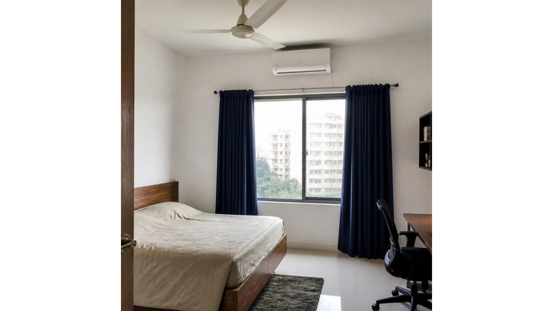
White Walls
White walls are the most flexible to pair, since they read as neutral regardless of undertone. Navy blue curtains add a crisp, grounded contrast; grey curtains give a softer, more muted contrast than navy; and deeper tones like bottle green or maroon add warmth and visual weight to an otherwise plain room. Paint manufacturer guidance from Asian Paints and Berger Paints both cover this pairing in more depth, with additional combinations to browse (Asian Paints: curtain colours for walls, Berger Paints: wall and curtain combinations).
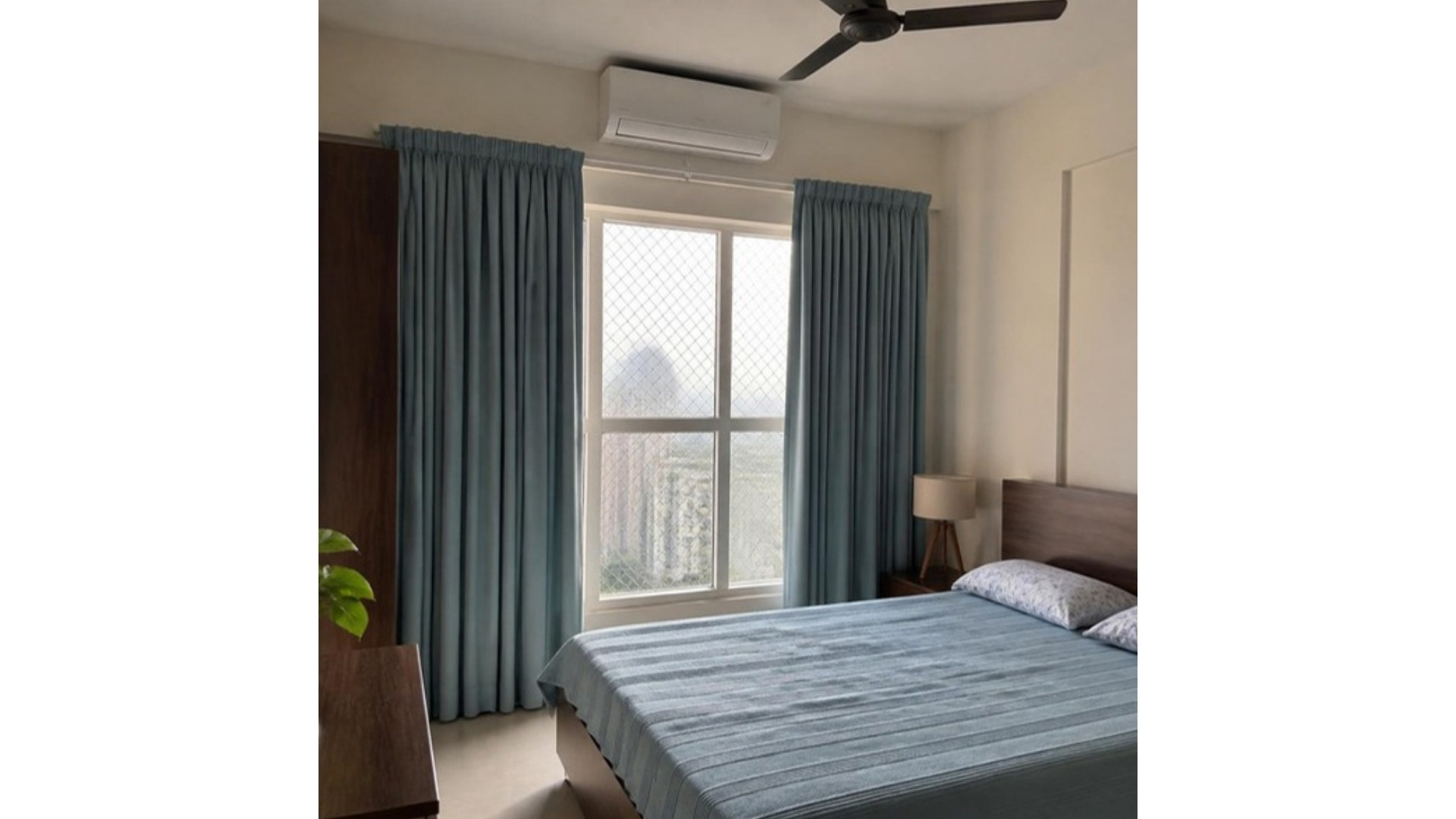
Cream Walls
White curtains against cream walls create a soft, low-contrast look that reads as clean rather than stark, since the two tones are close without being identical. For more contrast, a muted or dusty blue adds calm without clashing with cream’s warmth, and grey works as a neutral middle ground between the two. Treat bold choices like mustard or deep maroon as a higher-commitment option, since they shift the room’s overall mood more than a neutral pairing would.
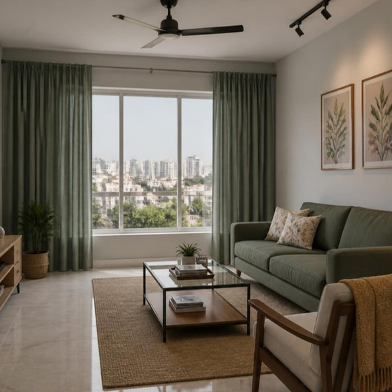
Grey Walls
Check whether your grey leans cool (blue or silver undertone) or warm (beige or brown undertone) before pairing, since this affects which curtain colours read as harmonious rather than slightly off. Cool greys generally pair well with white, soft blue, navy, or sage green; warm greys generally pair better with cream, warm white, or muted earth tones. Navy against a light or medium grey wall gives a noticeably more formal, upscale contrast than a pastel pairing would.
Blue Walls
White or cream curtains against a blue wall keep the look clean without competing with the wall colour, which suits households that want the wall itself to be the room’s main statement. Grey curtains add balance without much contrast. Mustard yellow is the highest-contrast option here, since yellow and blue sit opposite each other on the colour wheel; treat it as a bolder choice to sample carefully rather than a safe default.
Practical Considerations: Length and Rod Placement
Colour aside, how curtains are hung affects a room’s proportions as much as the colour choice does. One commonly cited guideline suggests mounting the rod roughly 4 to 8 inches above the window frame, with 4 to 6 inches suiting a standard 8-foot ceiling, and extending the rod 4 to 12 inches beyond the frame on each side so the curtains can stack clear of the glass when open (The Hues: how high should I hang my curtains). For panel length, that same guidance suggests the hem either hover about an inch above the floor or puddle a few inches onto it, though a shorter, sill-length curtain is also a legitimate practical choice for some rooms, such as a kitchen window, rather than a mistake to avoid.
What to Check Before Choosing
| Check | Why it matters |
|---|---|
| Wall undertone in daylight | Paint names like “white” or “grey” can lean warm or cool; this affects which curtain colours look harmonious |
| Room’s natural light | A north-facing room reads cooler than a south-facing one, which affects how both wall and curtain colours appear |
| Fabric weight and light control needed | Sheer, light-filtering, and blackout fabrics behave very differently even in the same colour |
| Rod placement and wall space | Confirms you have room to mount the rod high enough and wide enough for the look you want |
| Sample in your actual room | A swatch or small fabric sample under your room’s real light beats judging colour from a screen or showroom |
Frequently Asked Questions
What colour curtains go best with white walls?
White walls are flexible since they read as neutral. Navy gives crisp contrast, grey gives a softer contrast, and deeper tones like bottle green or maroon add warmth. There’s no single best choice; it depends on the mood you want.
Should curtains match or contrast with the wall colour?
Both are valid approaches. Matching or near-matching tones create a calm, blended look; contrasting tones make the window a focal point. Decide based on whether you want the wall or the window treatment to stand out more in the room.
How do I know if my grey walls are warm or cool?
Check the paint swatch or can for an undertone description, or compare it against a neutral white sheet of paper in daylight; a blue or silver tinge is cool, a beige or brown tinge is warm. This affects which curtain colours will look harmonious rather than slightly off.
How high should curtain rods be mounted?
A commonly cited guideline suggests roughly 4 to 8 inches above the window frame, with 4 to 6 inches suiting a standard 8-foot ceiling. Higher placement, closer to the ceiling, tends to make a room feel taller.
Do curtains have to reach the floor?
Not necessarily. Floor-length curtains that hover just above the floor or puddle slightly are a common designer default, but sill-length or café-length curtains are a legitimate practical choice for some rooms, such as a kitchen window.
What’s the highest-contrast curtain and wall colour pairing?
Colours opposite each other on the colour wheel give the strongest contrast, such as mustard yellow curtains against a blue wall. Treat high-contrast pairings as a bolder choice to sample carefully before committing to full curtains.
Sources & Notes
Curtain and wall colour pairing guidance references Asian Paints’ curtain colours for walls and Berger Paints’ wall and curtain combination guide, manufacturer guidance rather than independent colour research. Rod placement and curtain length guidance references The Hues’ curtain hanging guide. If you’re also planning bedroom wall colours, our bedroom wall colour combinations guide covers palettes and testing paint shades in more depth. Images in this guide are AI-generated design concepts, not photographs of a real, completed room or an exact colour match for any specific paint or fabric.