
Quick answer: Sage green with warm white, terracotta with cream, and navy with soft grey are three bedroom colour combinations to consider. You can use one shade on an accent wall and the other around it, or explore a different arrangement that suits your room. Compare samples beside your flooring, wardrobes and bedding, in both daylight and your usual evening lighting.
This guide uses original, AI-generated room visuals to illustrate each palette. They are conceptual references for colour pairing and proportion, not photographs of any real, installed project. Swatches and renders are approximate digital references, not manufacturer paint matches. Confirm any shade against a physical paint sample in your own room’s lighting before committing to a full wall.
Jump to a Combination
- 1. Sage Green and Warm White
- 2. Terracotta and Cream
- 3. Navy Blue and Soft Grey
- 4. Dusty Pink and Charcoal Grey
- 5. Mustard Yellow and Off-White
- 6. Teal and Beige
- 7. Lavender and Light Grey
- 8. Olive Green and Cream
How to Use Two Colours on Bedroom Walls
Two colours can create a focal point, highlight an alcove or distinguish different parts of a bedroom. One accent wall with a lighter surrounding colour is a straightforward option, but it is not the only arrangement. A single-colour room can also work well; choose the approach that suits your layout and the atmosphere you want. The combinations below are grouped by mood, not ranked, since the right one depends on your specific room, your furniture, and how you want the space to feel.
Eight Bedroom Wall Colour Combinations
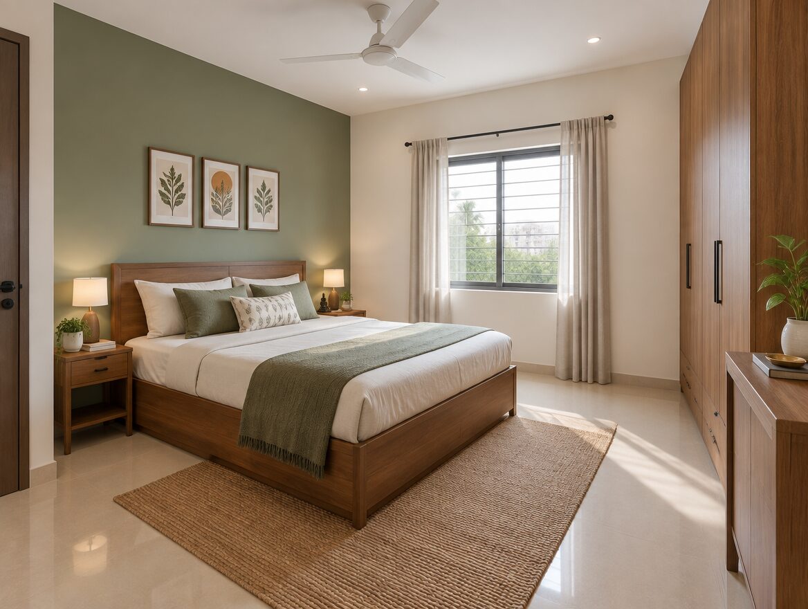
1. Sage Green and Warm White
Accent: Sage green
Base: Warm white
Sage green on the headboard wall with warm white on the remaining three walls. The warm white keeps the room feeling open while the sage green adds colour. Pairs well with wood-tone furniture (natural oak, walnut, or wood-laminate wardrobes). Compare it against your flooring and existing wardrobe laminate before committing, since sage can read greyer or more yellow depending on the room.
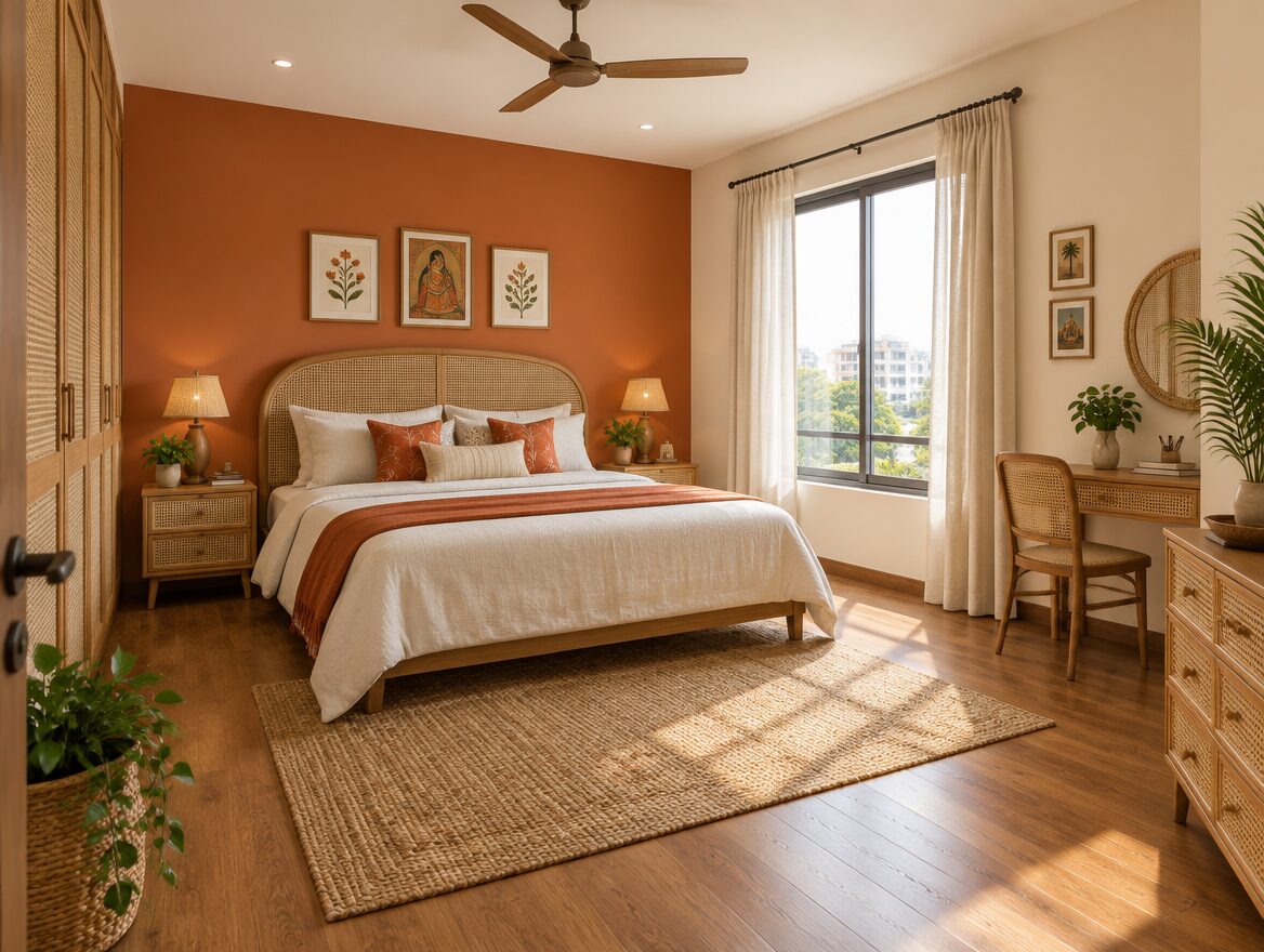
2. Terracotta and Cream
Accent: Terracotta
Base: Cream
Terracotta as the accent, cream as the base. A warm, earthy contrast that pairs naturally with rattan, cane, or wood furniture, and with warm-toned flooring. When sampling, check whether the terracotta reads too orange or too dark in your specific room; this varies more by lighting than by how it looks in a photo.
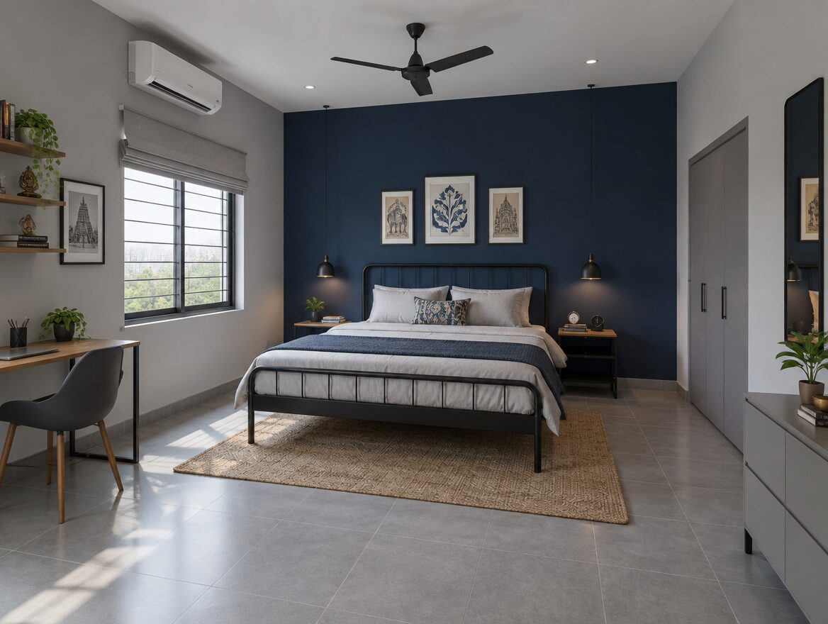
3. Navy Blue and Soft Grey
Accent: Navy blue
Base: Soft grey
A navy accent wall against soft grey on the remaining walls. A navy accent wall creates a clear contrast with lighter surrounding walls. Using navy more extensively produces a different, more enveloping effect. In a compact room, choose between an airy or a cocooning look, then test the shade with your lighting and furnishings rather than ruling navy out by default. It pairs with metal bed frames and modern furniture.
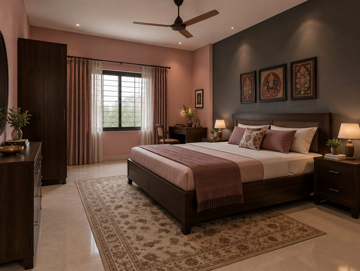
4. Dusty Pink and Charcoal Grey
Base: Dusty pink
Accent: Charcoal grey
Dusty pink (a muted, greyed-out pink rather than a bright pink) as the base, with a single charcoal grey accent wall. A contemporary, slightly muted pairing. It pairs with black or dark wood furniture. Check whether the pink reads peach, rose, or mauve under your own lighting before deciding, since muted tones shift more under artificial light than saturated ones do.
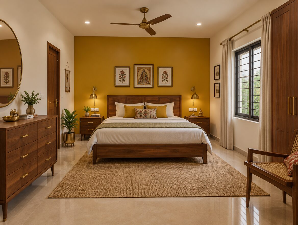
5. Mustard Yellow and Off-White
Accent: Mustard yellow
Base: Off-white
Mustard as the accent, off-white as the base. Mustard can introduce a warmer colour impression, but it does not replace adequate lighting; check the specific shade under your existing lights before choosing it, particularly in a room that doesn’t get much direct sunlight. It pairs well with wood furniture and brass or gold fixtures. Using it on a single wall keeps the room from feeling overly busy.
6. Teal and Beige
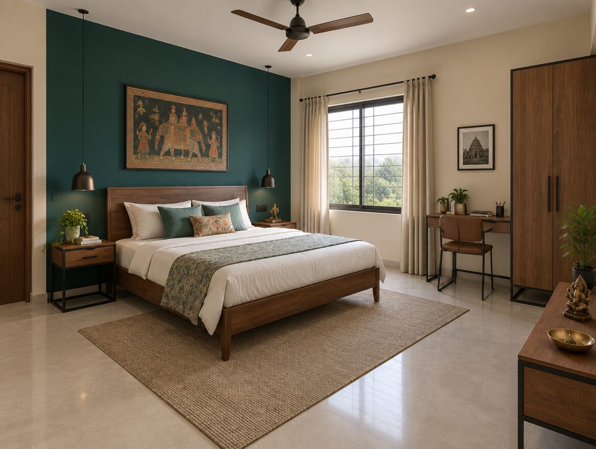
Accent: Teal
Base: Beige
A teal accent wall against a beige base. Teal sits between blue and green and reads as a jewel tone. Colour depth varies by the specific shade you choose; check whether the teal leans more blue or more green in your own lighting, and sample it rather than assuming a fixed depth. Works with both wood and metal furniture.
7. Lavender and Light Grey
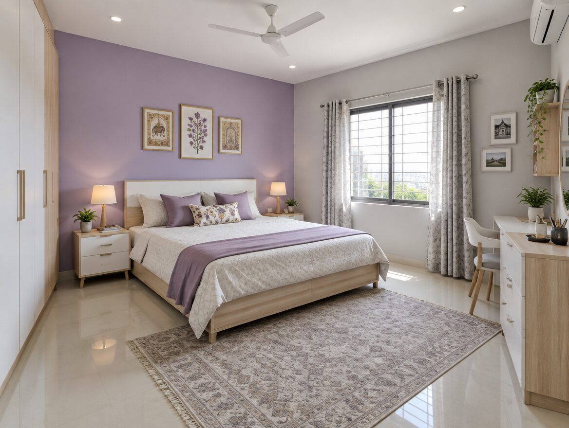
Accent: Lavender
Base: Light grey
A soft lavender accent against light grey. A paler, cooler-toned combination. It pairs well with white or light wood furniture. Check how the two shades relate under your evening lights specifically, since pale cool tones are the most likely to shift in appearance between daylight and artificial lighting.
8. Olive Green and Cream
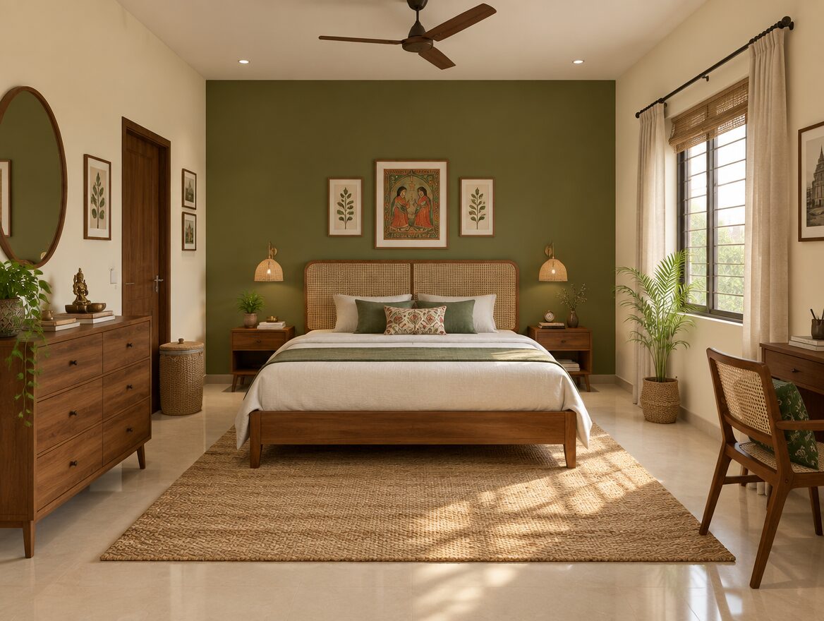
Accent: Olive green
Base: Cream
Olive green as the accent, cream as the base. A more muted, earthy alternative to sage green. It works well with wood furniture, woven textures (jute rugs, cane headboards), and warm-toned flooring. Check the olive’s yellow or brown undertone against your actual floor before committing, since undertones vary between batches and brands.
Comparing the Eight Combinations
| Combination | Suggested use | Furnishings to compare against | What to check in a sample |
|---|---|---|---|
| Sage green + warm white | Muted green accent with a pale base | Wood wardrobes and neutral bedding | Whether the green reads greyer or yellower in your room |
| Terracotta + cream | Warm, earthy contrast | Cane, wood and beige flooring | Whether the terracotta feels too orange or too dark |
| Navy + soft grey | Strong contrast | Metal, wood and neutral furnishings | The grey’s undertone and the depth of the navy |
| Dusty pink + charcoal | Muted pink with a darker focal wall | Dark wood, black details and pale fabrics | Whether the pink reads peach, rose or mauve |
| Mustard + off-white | A warm accent | Wood, brass and neutral textiles | Whether the yellow feels too saturated |
| Teal + beige | A deeper blue-green accent | Wood, metal and neutral flooring | Whether the teal leans blue or green |
| Lavender + light grey | A pale, cool palette | Light wood and white furnishings | How the two shades relate under evening lights |
| Olive + cream | An earthy green palette | Wood and woven textures | The olive’s yellow/brown undertone against the floor |
These are editorial suggestions based on common pairing principles, not scientific predictions or manufacturer-endorsed combinations.
How to Turn a Palette Into a Paint Shortlist
Choose two or three physical shade samples from your preferred manufacturer. Compare the accent and base together beside your existing flooring and wardrobes. Record the exact shade name, shade code, paint product and finish before requesting a quotation. Do not assume that two brands’ similarly named colours will match. Asian Paints publishes a colour catalogue with actual shade-card downloads organised by colour family, which is a reasonable starting point regardless of which brand you ultimately buy from.
Testing a Sample Before You Commit
- Shortlist the accent and base shades together.
- Follow the sample product’s application instructions.
- Allow the sample to dry as directed.
- Compare it beside fixed finishes and furniture, including your wardrobe laminate, flooring, skirting and door finish.
- Check it in daylight and under the lights you normally use in the evening.
- Record the chosen shade and finish.
A sample product may not reproduce the exact sheen of your final paint; confirm the finish separately with the manufacturer or dealer.
Finish Matters as Much as Colour
Compare the finish as well as the colour. Check the specific product’s sheen, cleaning instructions, surface-preparation requirements and recommended application system. Product names such as matt, silk and sheen are not a substitute for reading the manufacturer’s details for the exact product you’re buying.
A Practical Checklist for Indian Apartments
- Compare the paint sample with your existing wardrobe laminate, not just the wall in isolation.
- Include the floor, skirting and door finish in the comparison, not just the wall colour alone.
- Check the room with curtains open and closed.
- Account for daylight reduced by balconies or neighbouring buildings, which is common in dense Navi Mumbai nodes.
- Compare the sample under your actual ceiling and bedside lights, not just daylight.
- Consider how much wall will actually remain visible once your wardrobe, bed and other fitted furniture are back in place.
If you’re also checking the wall’s physical condition before repainting, such as cracks, dampness or old filler, see our DIY home repair and restoration guide. For accessories and finishing touches once the walls are done, our out-of-waste home decor ideas guide covers low-cost complementary pieces.
Frequently Asked Questions
Which two-colour combination works best for a small bedroom?
There is no single best combination. Sage green with warm white and lavender with light grey are lighter options to sample. Deeper palettes can also work if you prefer a more enveloping atmosphere. Compare the actual shades with your room’s lighting and furnishings before deciding.
Should the accent wall always be behind the bed?
No. The headboard wall is one option, but an alcove or another wall you want to highlight may work better. Consider doors, windows, wardrobes and how much painted surface will remain visible.
How do I check a colour in daylight and at night?
Apply samples according to the product instructions and let them dry. View the accent and base together in daylight and under your usual evening lights. Compare them beside your flooring and furniture.
Can I use two accent walls instead of one?
Yes. One accent wall is a straightforward starting point, but the number of coloured walls is a design choice. Test the intended arrangement rather than treating three light walls and one dark wall as a rule.
Do these combinations work with any flooring?
Not automatically. Compare both colours with the undertone and pattern of your existing floor, skirting and wardrobes. The suggested pairings are starting points, not guaranteed matches.
How much paint do I need for a single accent wall?
Measure the paintable area and check the exact product’s coverage and recommended coat system. Confirm whether the coverage figure is for one coat or the complete system, and calculate primer separately where required. As an example of why this distinction matters, Asian Paints’ Royale Lustre page lists roughly 7 to 8 sq. m. per litre for a single coat but roughly 4 to 4.6 sq. m. per litre once the recommended two coats are applied, so doubling a one-coat figure would overstate how much paint you actually need.
Design Notes and Paint-Selection Resources
The eight palettes above are editorial suggestions based on common colour-pairing principles, not proprietary or unique colour inventions, and not manufacturer-endorsed combinations. The room visuals are original, AI-generated concepts created for this guide, not photographs of a real, completed room. For selecting actual paint, see Asian Paints’ colour catalogue for shade cards, and the Royale Lustre product page as an example of how manufacturers publish coverage figures by coat count. Confirm finish, coverage and application details with the specific product and manufacturer you choose, since these details vary by brand and product line.